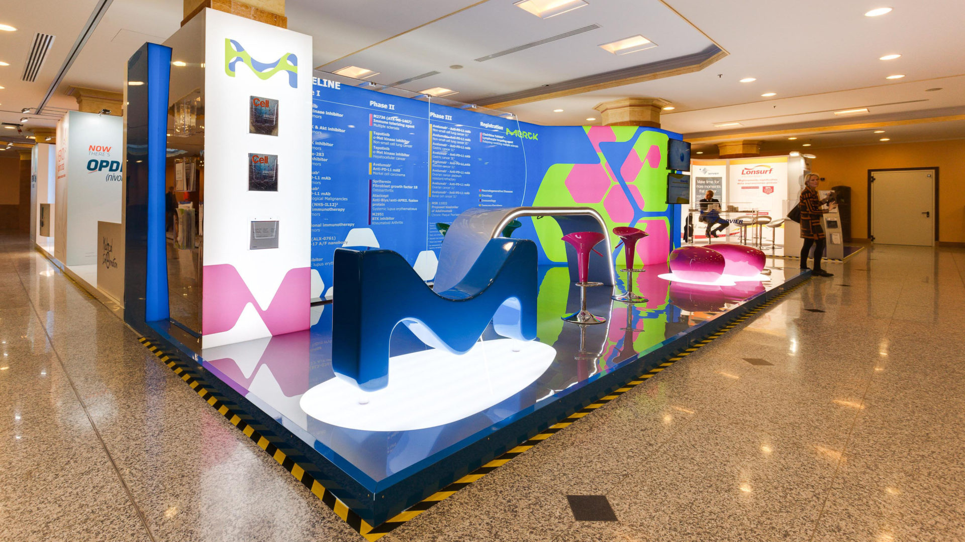
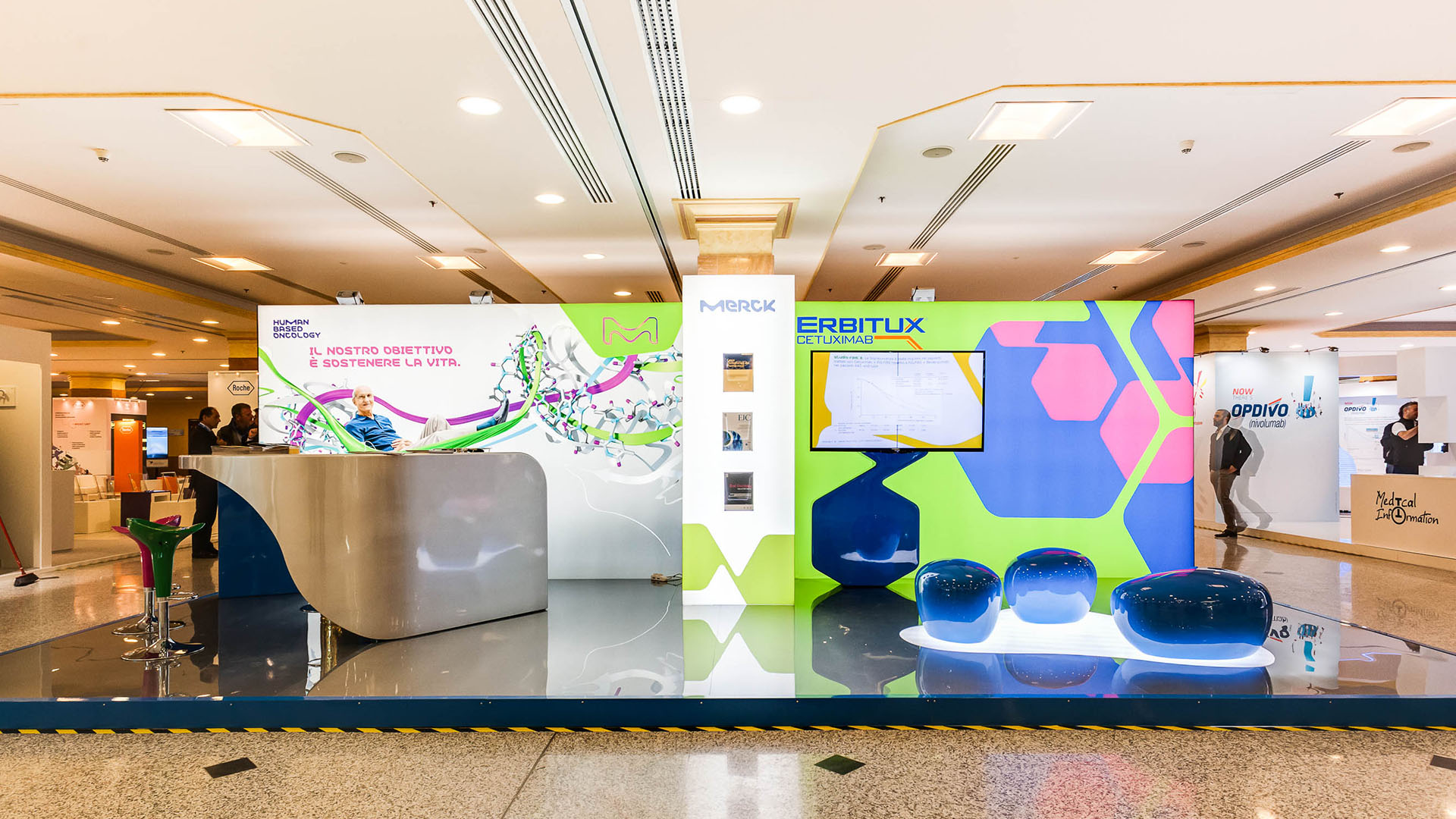
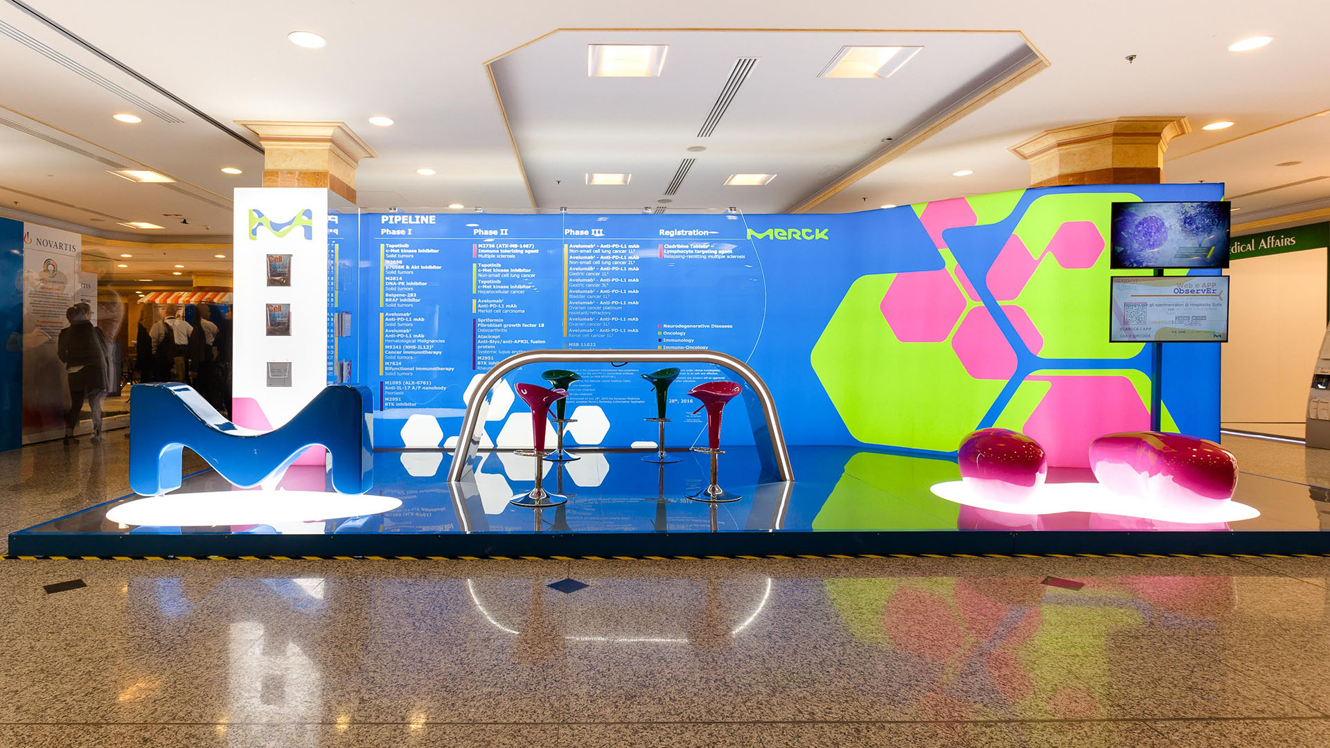
Merk fair stand
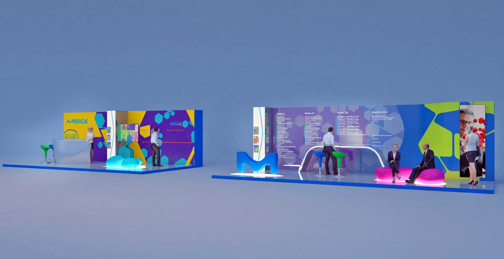
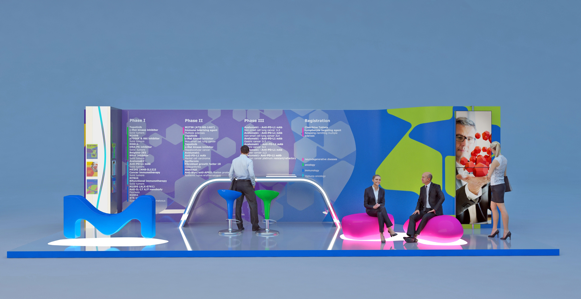
For the participation of Merck pharmaceutical to the 2016 AIOM convention we created a special concept and design inspired by Merck's very own keyword: vibrancy! We maximized the use of the space assigned to Merck by creating a two-area stand. This allowed for a more dynamic environment and a better contact with the public. The colors and layouts were carefully chosen, together with our client, to enhance the impact of Merck's ideas and products. The furniture and lighting of both sides of the stand created inviting, cosy and functional spaces allowing for multiple activities and multiple people to be attended at the same time. The success of the designed laid in the sophisticated yet minimal design, which allowed to minimize the costs while valorizing the message, ideas, and products of the client.
